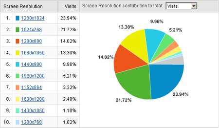
 At WebStrategies we tend to design websites with a 1024px resolution with an infinite background. Why? - because we want to try and ensure the lowest common denominator of users are able to view the site at the smallest resolution which happens to be 1024px for our sites. I thought it might be time to review these stats with the new year only a few days away to better understand what my minimum browser resolution should be when building our websites in 2012. I decided to examine our Google Analytics account and discovered something interesting - its seems we might not be out of the 1024px woods just yet.
On several sites the lowest res turned out to be anywhere from 6-9% which made me think that maybe it is close to time to bail on this low res, allowing us to create bigger and more beautiful sites with a larger browser canvass. But then I noticed something interesting - several sites where showing 1024px at a whopping 15 to 20% still. I think it is fair to say that once the percentage of users on 1024px starts to drop sub 10% then it's at least time to rexamine things. One fifth is a pretty sizeable chunk of viewers though no? The more I looked the more I realized these were not outliers but fairly ubiquitous across hundreds of sites we have built.
So what's the answer then?
I think for now the infinite background is the better option - no sense in cutting out a sizeable chunk of users based on a desire to make the website larger on screen. Maybe further into 2012 this might change.
However, the answer in my mind is strongly dependent not on global browser statistic averages but rather on whether or not you have data on your specific website. If you have access to, lets say, the last 6 months of Analytics data that will help you understand what the user demographic is for your particular site. Of course it's entirely possible that there might be something about your site that causes users to require a larger resolution, or a smaller one or perhaps they prefer to visit your site from a phone. Understanding your demographic and how they interact with your online presence is key to understanding how it should be presented to them.


Agree, disagree, or just have something to add?
Leave a comment below.