By default, Google Analytics provides us with nearly 70 standard reports. Add in dashboards, intelligence alerts, and real time reporting and that number jumps closer to 80. 80! That's 80 different ways to slice and dice your website's data. But wait, there's more! Most reports will visualize your data multiple ways, including as a pie chart, word cloud, comparison chart, pivot table, and map overlay.
With a seemingly endless number of different ways to view our data, our insatiable desire for business insight must be satisfied, right? Right??
Not necessarily.
Enter Custom Reports.
What are custom reports and where can I find them?
Custom Reports lets us build our own table and charts, showing only the metrics we're most interested in seeing. Custom Reporting can be accessed in the Customization tab found in the top orange bar.
Why should I use custom reports when there are so many standard reports already?
Standard reports are often cluttered with extraneous information or require multiple clicks to reach the information we want. Custom Reports helps solves this problem.
Let's jump in.
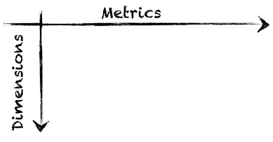
Most Google Analytics reports are broken down by metrics and dimensions. We'll need to select at least one metric and one dimension to build our custom report. Metrics run left to right on our report and are a numeric measurement, e.g. visits, pageviews, time on site, bounce rate, etc. Dimensions run top to bottom and put our metrics into context.
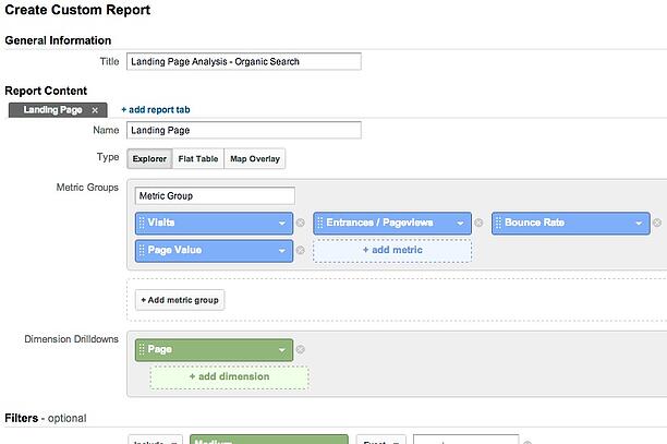
To build your own custom report, click the blue and green boxes and select the metrics or dimensions you want to use. For the first example, I'm going to analyze landing pages. The metrics I want to view are: Visits to a page, Entrances / Pageviews, Bounce Rate, and Page Value. I want to view these metrics by page, so I’m going to select ‘Page’ as my dimension.
Finally, I want to view this information only for visitors coming from organic search, so I apply a filter at the bottom to only include organic search. While adding a filter is optional, it's a great way to add more meaning to any report. After all, data in aggregate stinks.
Click ‘Save’ at the bottom to view the final report.
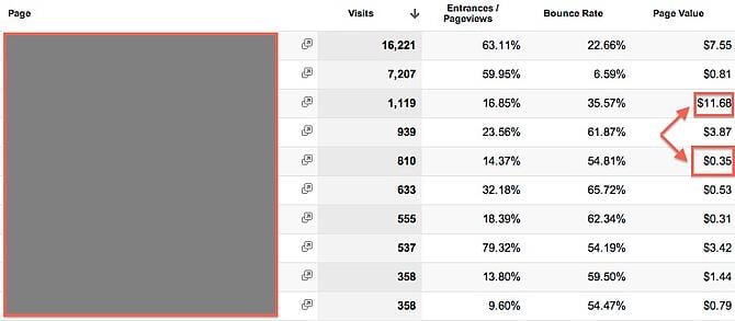
Talk about low hanging fruit. This report provides great insight as to which pages function well as landing pages and which do not. For instance, look at the Page Value of the third page compared to the fifth page (I've blocked out the actual page name to keep the data confidential).
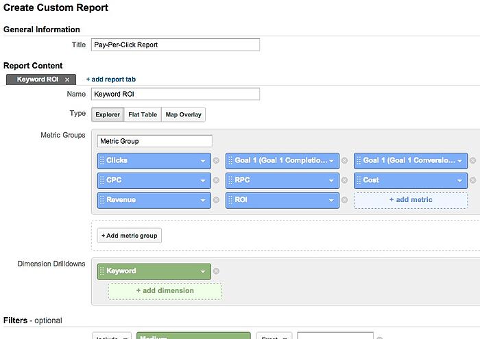
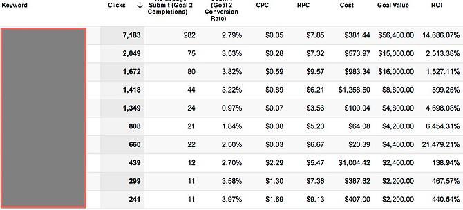
For the next example, I'm going to analyze my Google Advertising campaign to see which keywords produce the best return on investment. The metrics I want to add to my custom report are: Clicks, Conversions, Conversion Rate, Cost-Per-Click, Revenue-Per-Click, Total Cost, Total Revenue, and ROI. I want to analyze performance on a keyword level, so I select ‘Keyword’ as my dimension.
Since I want this report to be specific to pay-per-click, I add a filter at the bottom.
Here’s the report in its final form:
This report shows me how much each keyword costs me as well as how much revenue it produces. Awesome! Don't you wish you could view every marketing expense this way?
Did I mention you can schedule these reports to automatically email out to your team members?
Custom reporting is a crucial tool for analyzing and improving our campaign and website performance. I encourage anyone to build couple reports like the ones above that highlight investment, return, and opportunity. Use the email scheduler feature to share the reports with your team. By making the information focused yet concise, coming to a group consensus on how to improve online performance won’t be so daunting.





Agree, disagree, or just have something to add?
Leave a comment below.