It's time to get more serious about mobile. Projections have smartphone and tablet purchases outselling computers in 2011. Google predicts more searches will be done from mobile device than desktop devices by the end of 2012. People are viewing your website from a mobile device as we speak. What do you do, where do you look and what do you need to know about how the new wave of mobile activity is affecting your website and your ability to sell online?
The following are three ideas that can put you on the right track to better understanding the impact of mobile on your website.
Idea #1: What % of my visitors are coming from mobile devices:
This is the first question worth asking about our mobile traffic. While we watch the mobile industry explode all around us, we need to know how it's affecting us right now. When it comes to profiling our mobile traffic, Google Analytics helps us answer this overriding question (among several others). When we first started reporting mobile usage on our client sites late last year, we saw usage somewhere in the 1-10% range. Now we're seeing it in the 5-20% range.

The question is: are your visitors the early adopters or laggards? Is 1 in 5 of your visitors on a mobile device? If not, when can you expect them to be and what needs to be done to address this critical shift in website user activity?
The first step is easy enough: understand the ratio and understand if the criticality of mobile will be a problem down the road or a problem right now. Next, understand the nuances within this mobile segment so you know how to tackle it.
Idea #2: Segment the mobile traffic by device type
Some assume the designation of "mobile" only applies to smartphones, but as tablet devices increase in popularity and capability, we find them establishing themselves within the broader mobile category. When it comes to functionality - e.g. user interface and operating system design - tablets are designed more like smartphones than desktop computers. Tablets are touch devices like most smartphones and have a retooled operating system based on the simplicity of the major mobile operating systems.

So while the functionality and feel of a mobile device is more similar to a smartphone than a laptop, there is an key attribute that influences the user experience even more: the size. While most tablets may look like oversized smartphones, the bigger screen makes the experience of using a website more like that of a laptop than a smartphone.

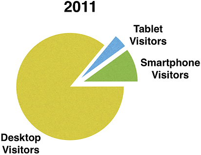
Tablet screens generally range in size from 7 inches (BlackBerry PlayBook, Samsung Galaxy Tab, HTC Flyer among others) to about 10 inches (iPad, Sony Tablet S, Samsung Galazy Tab 10.1 among others). In our research from sites we surveyed, we found only a tiny portion of tablet traffic (1-2%) come from 7 inch tablet devices. The rest of the tablet traffic are coming from iPads (~98%) which measure in just shy of 10 inches. Looking at industry data, iPads represents 68% of the global tablet market share followed by Android-based tablets at 27% and RIM at 5%. So while the industry data is a far cry from the almost unanimous preference we saw, the industry data still shows a strong overall preference for the iPad. Pulling data points from different sites, we found tablets represent anywhere from 25-35% of mobile traffic while total mobile traffic was 10-20% of overall site traffic. In other words, tablets are only a slice of a slice of the overall pie. But like everything else mobile, this segment is growing fairly consistently.

How does tablet traffic compare?
When it comes to visitor behavior, we found tablet traffic tends to behave much more like your desktop traffic than your smartphone traffic. On the sites we surveyed, we found our tablet traffic bounced 3-10% less than average, viewed 5% more pages during their visit than average and generally converted at or just below average. However smartphone traffic performed far less favorably in all of these categories - bouncing anywhere from 25-45% higher, viewing about 41% fewer pages in their visit and converting as low as 75% less than site average.
Tablet traffic tends to behave much like desktop traffic in terms of engagement and conversions. Smartphones are just the opposite.
What it means:
We may throw tablets into the mobile bucket, but tablet visitors behave just as well, if not better, than our desktop users. Smartphone visitors, on the other hand, behave far worse. When considering how well (or not well) your mobile traffic engages your site, it's best to treat your tablet visitors and smartphone visitors as separate segments.
Why do we see this behavior?
Going back to the data above, most of your tablet traffic are on iPads with 10 inch screens. Holding up an iPad to a 13 or 15 inch lap top screen, you'll quickly understand how much more an iPad is like the laptop on your desk than it is the smartphone in your pocket.
Our data is further supported by the nearly identical functionality between the iPhone and the iPad - the difference only being the extra 6.5 inches in screen. A difference that makes, well, all the difference.
Flash or No Flash
Most new smartphones support Adobe Flash. That is, most smartphones except Apple mobile devices. Apple made a bit of a splash when it announced its iPhone and iPad product lines would NOT support flash. Many predicted it would have a significantly negative impact on whether people choose Apple hardware.
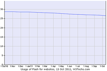
Now we have to consider how much this matters. Going to back the sites we surveyed, we found 65-75% of mobile traffic was viewing the site from an Apple mobile device. So if your site is dependent on flash in any way, most mobile visitors are receiving a subpar experience. The number of websites using flash overall is slightly on the decline (perhaps for this very reason), but with a quarter of total websites using flash, it certainly presents an issue.

Time to take action: The solution is simple: have one site that services both your desktop visitors and your mobile visitors (quite the challenge!) or have a separate desktop/tablet site and a separate smartphone site. Treat them as independent sites, optimize them accordingly and analyze their visitors separately.
Now you need to ask yourself: Is mobile significant for you right now? What is the makeup of my mobile visitors? Is your website coded in a way that's not friendly to all devices? Answering these questions will better prepare you for what the internet will transform into over the next 12-18 months.


Agree, disagree, or just have something to add?
Leave a comment below.